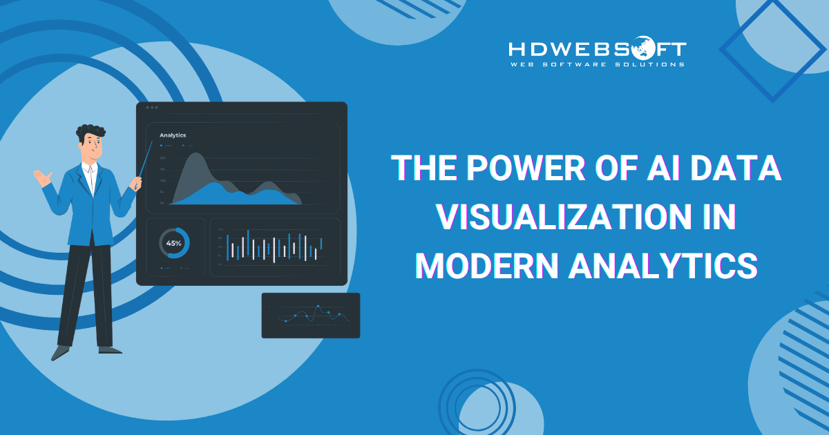
The Power of AI Data Visualization in Modern Analytics
AI data visualization is revolutionizing how businesses and individuals understand the vast amounts of information generated daily. In today’s data-rich world, from customer interactions and sales figures to scientific research and social media trends, data is ubiquitous. However, raw, unorganized data can be overwhelming and challenging to interpret. This is where the technology emerges, leveraging artificial intelligence to elevate data understanding to unprecedented levels.
This blog post will first delve into the definition and significance of AI data visualization. Then, it will explore its transformative impact on business analytics and data science. Finally, we’ll outline the crucial features to consider when selecting an AI-driven platform and highlight some available top tools.
What is AI Data Visualization?

At its core, AI data visualization combines the art and science of visual data representation with the intelligence and automation capabilities of artificial intelligence. It goes beyond simply displaying data. It intelligently analyzes, interprets, and presents information in a way that reveals hidden patterns and ultimately empowers better decision-making. Think of it as having an intelligent assistant that not only creates insightful visuals but also explains what those visuals mean and why they matter.
AI vs. Traditional Data Visualization
Traditional data visualization relies heavily on human expertise to select appropriate chart types, identify relevant points, and draw meaningful conclusions. While still valuable, this process can be time-consuming and prone to human bias. AI for data visualization, on the other hand, automates many of these tasks. Machine learning algorithms can analyze vast datasets and identify correlations and anomalies that might escape human observation. Meanwhile, they also suggest the most effective ways to visualize this information.
Essentially, AI data visualization is about making data more understandable and actionable. It empowers users, regardless of their technical expertise, to explore data, uncover valuable insights, and communicate their findings through visuals. This fusion of AI and visualization transforms raw data from a collection of numbers into a powerful tool.
The Impact of AI on Business Analytics and Data Science
The integration of AI into data visualization is having a profound impact on the fields of business analytics and data science.
Unlocking Deeper Insights and Competitive Advantage
For business analysts, AI for data visualization can significantly enhance their productivity and the depth of their analysis. Instead of spending countless hours manually sifting through spreadsheets and creating basic charts, AI-powered platforms can automate these routine tasks. Consequently, they’re free to focus on higher-level strategic thinking, exploring the “why” behind the data and formulating actionable recommendations.
Moreover, the technology can help business analysts uncover insights they might otherwise miss. AI data visualization algorithms can identify subtle patterns and correlations that are not immediately apparent to the human eye. Resultantly, they lead to a more comprehensive understanding of business performance, customer behavior, and market trends.
This ability to extract deeper insights can provide a significant competitive advantage. Therefore, businesses are better equipped to identify new opportunities, streamline their operations, and ultimately deliver improved customer service.

By using AI for data visualization, you’re giving your competitors a run for their money.
Enhancing Communication and Efficiency
As for data scientists, artificial intelligence for data visualization provides powerful tools for exploring and communicating their findings. While data scientists are skilled in statistical analysis and model building, effectively communicating complex data insights to non-technical stakeholders can be a challenge. AI-driven data visualization platforms can help bridge this gap. They do so by automatically generating clear and compelling visuals that illustrate the results of sophisticated analyses and ML models. In all, data scientists can effectively convey the value of their work and facilitate data-driven decision-making across the organization.
Furthermore, AI data visualization can accelerate the data science workflow. Features like automated data preparation and intelligent visualization recommendations can streamline the initial stages of data exploration. Hence, data scientists can quickly gain an understanding of their data and identify potential avenues for further investigation.
The ability of artificial intelligence data visualization to handle vast amounts of data in real-time also opens up new possibilities. As dynamic and rapidly changing datasets are quickly analyzed, more timely and relevant insights are the best results.
Which Features to Look for in an AI-Driven Data Visualization Platform

When selecting an AI for data visualization platform, several key features should be considered. The chosen platform should meet your specific needs and empower effective data exploration and analysis.
Natural Language Querying (NLQ)
This feature allows users to ask questions about their data using natural language. Imagine it’s similar to how they would speak to a human. The AI data visualization then interprets the query and generates the appropriate visualization as an answer. Ultimately, it makes data exploration incredibly intuitive and accessible to users without deep technical skills. Look for platforms that support a wide range of natural language queries and can understand context and intent.
Automated Insights
A powerful, advanced data visualization platform should do more than just display data. It should automatically identify key trends, patterns, anomalies, and correlations and present these insights in a visually compelling and easy-to-understand format.
These automated insights can save significant time and effort, highlighting important findings that might otherwise be overlooked. The platform should also provide explanations for these insights, helping users understand the underlying drivers.
Further reading: How HR Analytics Are Changing Business.
Intelligent Visualization Recommendations
The platform should leverage AI to suggest the most appropriate chart types and visualization techniques based on the nature of your data and the questions you are trying to answer. AI data visualization ensures that your data is presented in the most effective way to communicate your intended message and facilitate understanding. The recommendations should also be customizable, allowing users to fine-tune the visualizations as needed.
Predictive Analytics and Forecasting
Having predictive analytics and forecasting capabilities built into their AI-driven data visualization platform is essential. This is especially necessary for businesses aiming to stay ahead of the curve.
Look for platforms that offer built-in ML models or seamless integration with other AI/ML tools. By then, forecasting and scenario planning are enabled. Also, the platform should provide clear visualizations of the predictions, along with measures of uncertainty.
Personalized Dashboards and Reporting

An ideal platform should allow for the creation of personalized dashboards that adapt to individual user needs and preferences. AI can support this process by learning user behavior over time. In doing so, it can highlight the metrics and visualizations most relevant to each user, enhancing personalization.
The AI data visualization platform should also include robust reporting features. This enables users to share their insights effortlessly, presenting information in a clear, concise, and easily understandable format for broader audiences.
Automated Data Preparation
Cleaning and preparing data for analysis can be a time-consuming and often tedious process. That’s why you should look for AI for data visualization platforms that offer automated data preparation features. They can include data cleaning, transformation, and integration from various sources. In all, the benefit is that it significantly streamlines the data analysis workflow and ensures data quality.
Collaboration and Sharing Features
Data analysis is often a collaborative effort. The platform should include features that promote seamless collaboration among team members. These may include shared dashboards, annotation tools, and options to share visualizations and reports easily. This way, everyone stays aligned and informed.
Integration Capabilities
Finally, it’s important to ensure that the AI data visualization platform seamlessly integrates with your existing data sources, BI tools, and other relevant applications. After all, it’ll provide a smooth and efficient data flow and prevent data silos.
Let’s take a look at A Data Analytics Platform that integrates different Technologies.
Top AI Tools for Data Visualization
The landscape of AI for data visualization tools is dynamic and filled with innovative platforms. Each of them offers unique strengths and caters to different user needs. Selecting the right tool can significantly impact your ability to extract meaningful insights from your data. Here’s a more in-depth look at some of the leading players in this space:
Domo
Stands out as a comprehensive data platform, Domo seamlessly integrates AI capabilities throughout its entire lifecycle of data management. It’s not just a visualization tool. It’s a complete ecosystem for connecting to data sources, preparing data, building interactive dashboards, and leveraging AI for advanced analytics.

Key features
The platform’s commitment to AI is evident in features like AI Chat. It’s a conversational data agent that guides users through analysis by allowing them to ask questions in natural language and receive data-driven answers. This lowers the barrier to entry for non-technical users. Additionally, it empowers them to explore data and uncover insights from AI data visualization without needing specialized skills.
Beyond NLQ, it excels in providing predictive analytics, recommending optimal visualizations based on the data’s characteristics and the user’s goals. The platform also automates data ingestion processes, saving valuable time and effort. Domo offers various visualization types, from standard bar graphs and line charts to more advanced formats like heat maps. These visuals can be automatically customized to align with specific business needs, enhancing relevance and clarity.
What’s more, Domo places a strong emphasis on data security, ensuring that sensitive information remains protected within the platform. Its pre-built AI models can be readily deployed on user data, enabling sophisticated analysis without requiring extensive machine learning expertise. This makes AI for data visualization accessible and actionable for a broader range of business users.
ThoughtSpot
Next, ThoughtSpot has carved a niche for itself by pioneering a search-first approach to AI data visualization. It uniquely combines the power of AI with an intuitive search-based interface. Owing to this, users can ask complex business questions in natural language and receive instant, visualized answers.
This paradigm shift moves away from pre-defined dashboards. Users are free to explore data on their terms, driven by their specific questions. The platform leverages large language models from industry leaders like GPT and Google PaLM to enhance its AI capabilities. Therefore, íts natural language interaction is even more sophisticated and context-aware.

Core attributes
The tool’s AI capabilities democratize data analysis, making it easy for users to generate complex visualizations. ThoughtSpot also offers robust customization options for visualizations and dashboards. Moreover, its AI-driven search functionality goes beyond simply answering questions. It can also proactively suggest relevant insights based on the data being explored, helping users uncover hidden opportunities or potential problems.
Additionally, ThoughtSpot provides AI-assisted data modeling, simplifying the often-complex process of preparing data for analysis. This focus on user-friendliness and powerful AI data visualization under the hood makes it a compelling option for organizations.
Tableau
As a long-standing leader in the field, Tableau has strategically integrated artificial intelligence features to enhance its already robust platform. The platform has incorporated large language models to enable analysts to interact with data using natural language. Furthermore, it leverages AI to automatically surface and visualize relevant data within embedded dashboards and reports.

Principal components
Its AI-powered predictive analytics capabilities allow users to build and visualize forecasts directly within the platform. As a result, they can anticipate future trends and make data-driven plans. The platform features one of the most advanced and extensive visualization libraries on the market. It offers users a broad selection of tools to effectively communicate their data stories and insights with clarity and impact.
The platform’s approach to AI data visualization focuses on augmenting the capabilities of data analysts. It helps accelerate their workflow and, in turn, enables them to unlock deeper, more meaningful insights. Its strong community and extensive resources further contribute to its appeal, making it a popular choice for organizations of all sizes.
Check out our case study: Data Visualization Platform for Businesses of All Sizes.
Power BI
Microsoft’s Power BI benefits from its seamless integration with the broader Microsoft ecosystem. It includes pre-built AI tools available in Azure and other Microsoft platform features. This deep integration offers a comprehensive suite of AI for data visualization capabilities that are both powerful and user-friendly. Power BI’s AI-powered visualizations are designed to be intuitive, allowing even non-technical users to create and customize insightful reports and dashboards.
Highlights
The tool offers a range of built-in AI features. Namely, sentiment analysis to understand customer opinions, key phrase extraction to identify important topics in text data, language detection, and image tagging. These features extend the analytical capabilities of the platform, allowing users to gain deeper insights from diverse data types.
In addition, it supports a wide variety of visual formats, from standard charts to more specialized options. Therefore, its accessibility, affordability, and tight integration with Microsoft products make Power BI a popular choice. Especially for organizations already invested in the Microsoft ecosystem, looking to leverage AI data visualization.
Polymer
The tool is known for heavily investing in AI to simplify the process of data exploration and insight discovery. Its AI-driven features are designed to abstract away the complexities of data preparation and visualization creation.. Polymer supports a variety of visual formats, including interactive dashboards, detailed reports, and engaging infographics. Needless to say, Polymer’s users is provided with flexible options for presenting their findings.

Notable characteristics
Its feature, automated data storytelling, helps users create compelling narratives around their data and interactive visualizations for deeper exploration. The platform’s AI-driven insights proactively highlight important trends and patterns, guiding users towards key discoveries.
With its strong emphasis on AI-powered automation and user-friendly design, Polymer stands out as an attractive option. As a result, it appeals to individuals and teams looking to visualize and understand their data quickly and easily. The platform offers impressive accessibility and ease of use in the realm of AI data visualization. This is thanks to its ability to connect to multiple data sources and low-code interface. In essence, users can quickly integrate and explore their data without deep technical skills.
Conclusion
AI data visualization represents a significant leap forward in how we understand and interact with data. As the volume and complexity of data continue to grow, the technology will only become more critical. Embracing AI tools for data visualization is no longer a luxury but a necessity for anyone looking to harness the full potential of their data and gain a competitive edge in today’s fast-paced environment. The future of data understanding is undoubtedly visual and intelligently powered.